Three quick tips = big difference to your website

I've recently spent a LOT of time looking at tourism business websites. I'm one of the judges for the VIsitEngland Awards for Excellence and have been sifting through countless application forms and then double-checking the look, feel and contents of websites.
Considering these are some of the best tourism businesses in the country, it's been frustrating to see how many websites are not as good as they need to be to impress potential visitors.
The best websites aren't necessarily the most expensively-designed. Simple improvements can make a big difference.
Here are some suggestions you can perhaps use:
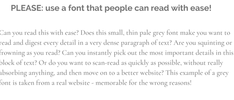
1. Make your website easy to read by using a legible font (I did say these were simple tips, yet there's a weird fashion for pale illegible fonts at the moment)
2. Say where your business is, prominently. Don't assume everyone's heard of your village or knows which region your town is in. >50% of accommodation websites aren't clear enough about their location - or why the location is attractive.
3. Show why your business is special. If you use the over-used word 'unique', explain why!
0 comments
Leave a comment